10 Reasons Your Application Isn't Accessible and What You Can Do About It
Since this is just a short article, I will not go hard on into how to technically solve all of these issues. I’m just trying to get you aware of them and give you a little nudge on how to solve them in a superficial manner.
The first six issues are mostly technical, and the last four more structural
Issue nr. 1: Insufficient alternative text for images and graphics.
A person with blindness or deafness needs to be able get the same information as everyone else.
To detect some of the problems you can use scanners like pa11y.
A scanner will be able to tell you if an image or video lack any text alternative at all.
However, a scanner might not recognize if the alternative text provides enough context for the image or video.
For example: An image of a cat that is trying to catch a bird can have the descriptive text “A cat and a bird”, but that doesn’t say anything about what the image is trying to tell in this context. In an article about birds that are going extinct the image text might be “Bird being hunted by a cat”, but in an article about cat behavior, the image text might be “Cat hunting a bird for fun”.

Issue 2: Failure to use available text alternatives for videos and audio files
The necessary types of text alternatives must be carefully considered. There are various kinds of text alternatives you can include.
- Captions: Videos with sound must have captions so that people with hearing impairments can follow along.
- Transcriptions: Audio files and videos must have text transcriptions.
- Audio Descriptions: Videos with important visual elements must include audio descriptions for visually impaired users.
You can use an accessibility scanner to catch many of the missing text alternatives.
Issue 3: Missing / bad link text
We as developers have a tendency to put small icons or insufficient text like just “read more” as link text. And how is a person with blindness supposed to know what “more” means? Instead use descriptive link texts for all links, and aria-labels for icons.
For example the aria-label “link to facebook page” on the link-tag wrapped around a facebook-logo.
A scanner like pa11y will probably catch a lot of the missing links, but will not be able to distinguish between a good and a bad link text.
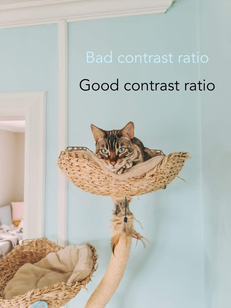
Issue 4: Inadequate contrast between text and background
Which can make it difficult for people with visual impairments to read, and solving this also makes it better for everyone to read your content.
A lot of contrast ratio errors is possible to capture with an accesibility scanner.
You can also use the inspect tool. The inspect-tool in your browser is a very useful tool. Most browsers let you hover over an element and see the contrast ratio right then and there.
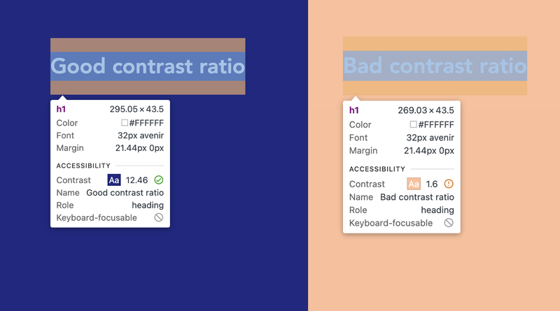
But remember! Text on images and gradients is not easily caught with just computer tools. Make sure also to manually check the colors in the background up against the text color.
Issue 5: Lack of content structuring with proper use of headings and lists.
For assistive techologies to work optimally, the webapp needs to be written correctly with the correct tags.
It's important to begin building a page or app with the appropriate tags, because rewriting all the components will take time.
My best tip here is that whenever you want to use a div, try to think of a more appropriate tag. Use p-tags for paragraphs and nav-tags for navigation.
Issue 6: Missing keyboard navigation or incorrect focus order
Hindering users who rely on keyboard navigation aka people who can’t use the mouse on a computer.
One eaasy way to check your app yourself is to use your own keyboard. It’s a quick and easy way to check your page. Ensure all elements are logically ordered and accessible.
A common mistake is to make clickable elements only reachable for mouse and only clickable by mouse click. Make sure you have used the right html tag, and use tabindex in need.

Issue 7: Inadequate testing with accessibility tools and user testing with individuals with various disabilities.
It’s difficult to develop and test for challenges you don’t have yourself. When you develop something, you tend to take your own experience of the product as a starting point.
And you assume that users of screen readers and assistive devices are experts themselves. They are not; they use screen readers because they have to.
David, a 75-year-old who just started to go blind, but has never worked on a computer in his life, doesn't have any better prerequisites than you to know how to navigate a screen reader.
Set up testing routines. User testing is extremely important. User test on people with disabilities. Make sure testing with disability devices is a part of the estimate.
But estimations takes us right next to the next issue.
Issue 8: Lack of accessibility awareness during the design and development process.
Developers tend to forget about accessibility when they estimate. And when development has started, it's too late to incorporate it because one may feel there isn't enough time.
Take responsibility and focus on accessibility already in the planning process. Make sure every participant know how important it is. The customer, the designer, the developer, the editor who are going to publish content on the webapp. Everyone needs to be on board.
However, the fact that everyone wants to focus on it doesn't necessarily mean that everyone knows how. So, that brings us to the next reason.

Issue 9: Inadequate training and awareness among developers and designers about the importance of universal design and how to achieve it
Encourage developers and designers to take courses. There are plenty of easily accessible courses available, which can be completed in just a few hours of the workday. They are definitely worth the investment.
Issue 10: Economics.
People believe it’s much more expencive than it is. So they fall into the trap of using accessibility overlays instead of coding the website universally from scratch.
Design for simpler and cheaper websites. Keep the routines and guidelines in mind, and scale down functionality and needs.
Don't compromise on accessibility. A black and white website in Times New Roman with all elements listed one after the other without any design at all is better than a website that is not universally designed. At least it doesn't exclude anyone.
Are you wondering why this article is stacked with cat images? Find out why by watching the talk is article is based on by following this link: https://adacon.no/talk/elise-kristiansen-ten-reasonse-your-application-is-not-accessible/


